Children's Bathroom Refresh
Time for a home project post! We’ve been in our new home for almost a year and a half and we’re taking time to live in the space instead of rushing the design process.
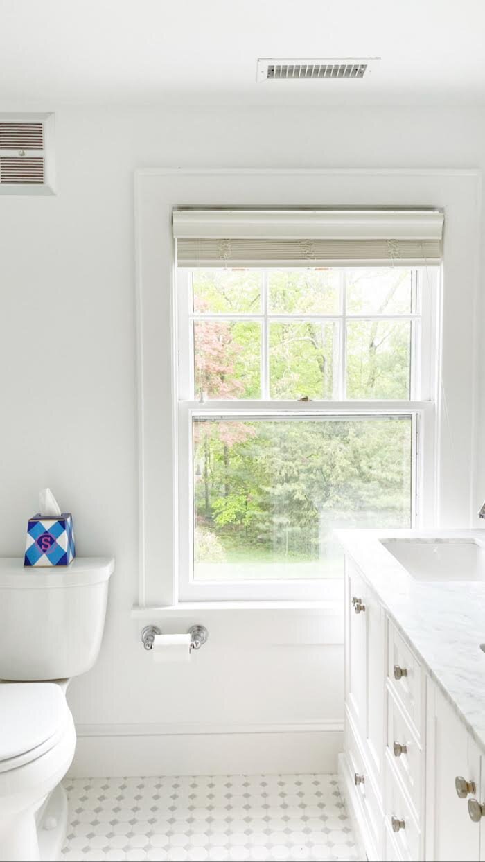
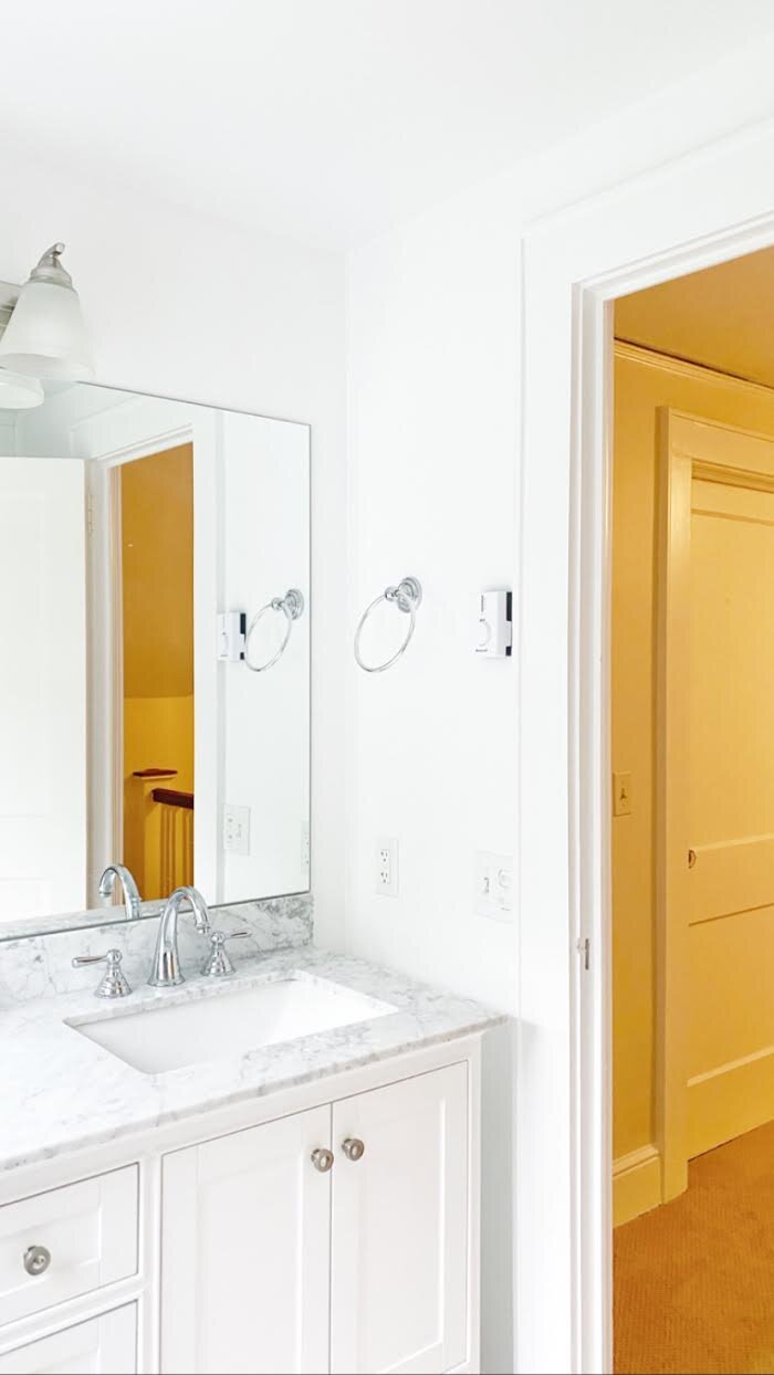
I’ve been slowly chipping away at a few rooms simultaneously and my children’s upstairs bathroom is finally complete. Fortunately, the previous homeowners had recently renovated it with updated plumbing and fixtures, which left me a blank canvas to have some fun.
The bathroom was all white with marble countertops which was simple and pretty, but being a kid’s bathroom I knew it’s a safe space to bring in some pops of color and pattern.
Wallpaper in here was a must as well as some window treatments, a shower curtain, and some new towels. Now since I have a boy and a girl I had to keep the space gender neutral. All of the fun floral wallpapers out there were not going to fly with my 7 year old son. But fortunately for me, they both love blue like their mama.
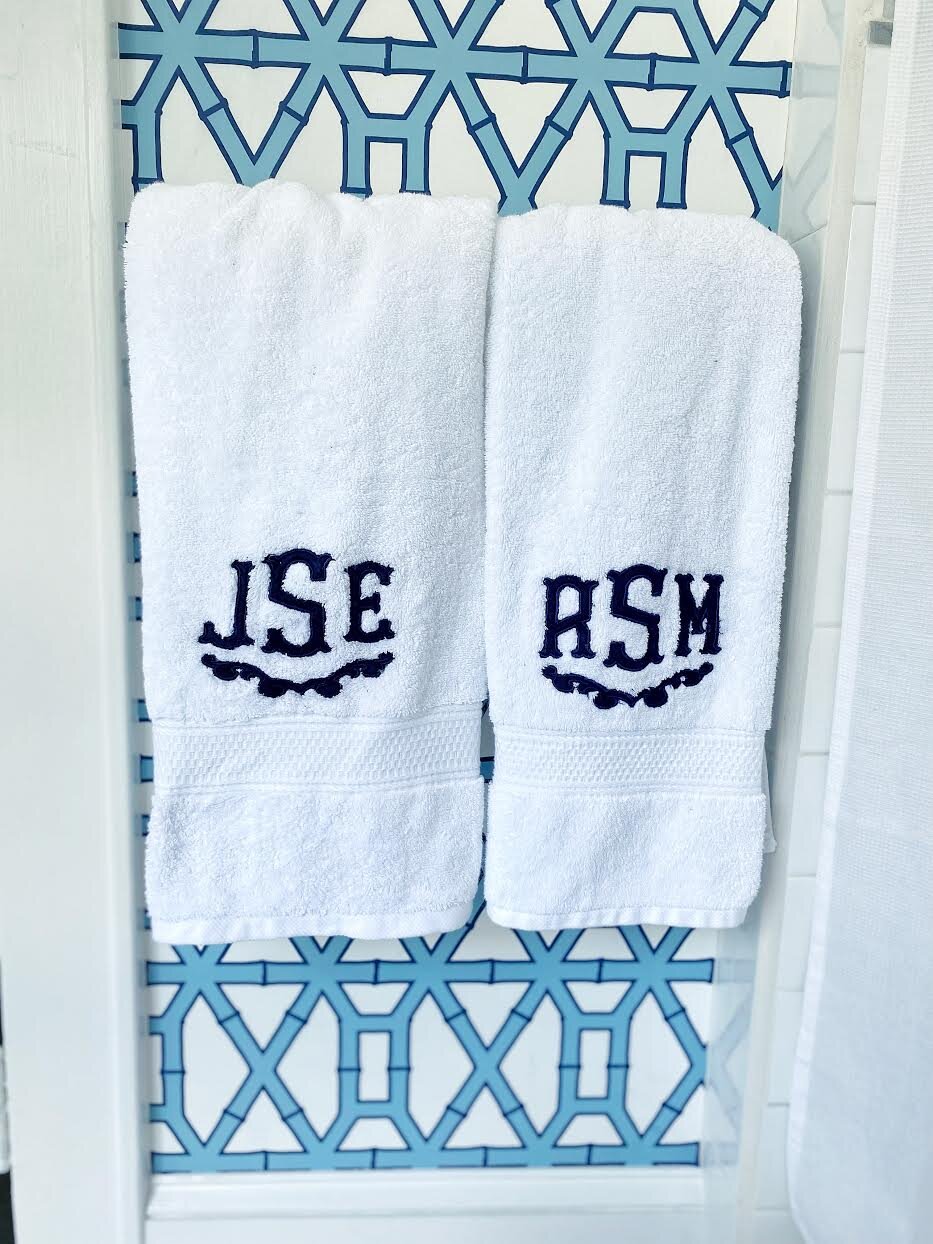
One of my favorite wallpapers from our last home was the bamboo wallpaper from Clairebella Studio. We used the pink colorway in our first floor hallway and they recently came out with a blue, so I knew this would be the winner for my children’s bathroom.
Next up, I wanted a simple cornice with a bold pattern. I chose “Aurelie” Lulu DK for HC Monogram fabric with a navy trim. The fabric was sourced from Palomino’s Attic owned by designer Kate Ferguson of Palomino Bazaar. Check out @palominosattic for unique vintage/antique finds and left over designer fabrics. It’s truly pattern play at it’s finest in there and why not spice it up when it’s the kid’s bathroom!
If it isn’t walking, put a monogram on it - right? The towels and shower curtain are from Southern Linens. I have used them for my euro shams in my bedroom and couldn’t wait to see their towels and shower curtain. They certainly did not disappoint. I love all their monogram fonts and style options. I selected the Dimples font in Prussian blue. I always love mixing different shades of colors into the rooms I’m designing to add more interest to the eye.
If you’ve been following me for a while you’ve learned I have a tendency to create bold spaces. I enjoy designing a room that first and foremost brings my family joy, but is also a place that people will remember and be inspired by. It’s all too easy to design neutral simplistic room, so why not give people something that will “wow” them. I say do what makes your house feel like home and speaks to your personality.


